Long, structured creative briefs
Describe the canvas, content blocks, visual hierarchy, and on-image copy in one request. Qwen Image 3.0 accepts instructions up to 4.5k tokens for dense visual direction.
Build text-rich posters, storyboards, UI concepts, and multilingual image assets with a stronger creative brief.

Qwen Image 3.0 is built for images that must carry information as well as style: readable copy, clear layout, multilingual text, and fine visual detail in the same frame.
Describe the canvas, content blocks, visual hierarchy, and on-image copy in one request. Qwen Image 3.0 accepts instructions up to 4.5k tokens for dense visual direction.
Plan posters, menus, labels, formulas, and information graphics where on-image copy matters. Qwen highlights text rendering as small as 10px, then human review keeps the final asset accurate.
Create localized posters, social assets, and product visuals across 12 languages. Supply the target language and exact copy you want the image to carry.
Plan newspapers, storyboards, complex grids, and interface scenes when one frame needs to communicate more than one idea. Structured layouts are a core Qwen Image 3.0 use case.
Qwen Image 3.0 is useful when an AI image needs to behave like a designed asset, not just a pretty scene. It can carry readable text, organized layout, multilingual copy, fine detail, and knowledge-based structure in one visual brief.
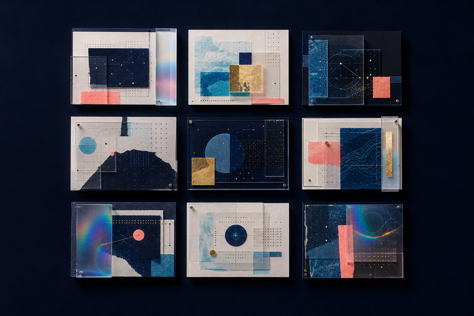
Use Qwen Image 3.0 when a single image needs many related pieces to sit together without becoming visual noise. Think of a newspaper page, a nine-panel learning graphic, a multi-scene storyboard, or a layered product explainer.
Fine text, material texture, line work, and small visual cues matter most when the brief makes them specific. Use Qwen Image 3.0 for image ideas where tiny labels, product surfaces, annotation marks, typography, and close-up visual details are part of the result.

Qwen Image 3.0 is designed for more than isolated objects. It fits creative work where the image needs language, style, subject knowledge, and recognizable context, such as UI scenes, education graphics, diagrams, posters, and editorial layouts.
Use a target language, exact source copy, and a clear reading order when making localized visual assets.
Name the visual medium and the details that define it, rather than relying on a style word alone.
Describe hierarchy, labels, state, and purpose when an image should resemble a web, game, or livestream environment.
Start with the finished deliverable, set the layout, and then provide exact copy. This order gives detailed visuals a clearer structure before style enters the brief.
Start with the output you need, such as a product one-pager, a teaching diagram, a multi-panel social post, or a storyboard. Give the image a clear job before adding style.
List the sections, their order, the focal point, and the reading flow. A layout brief is easier to follow when the model knows what matters first, second, and last.
Write the headline, labels, language, and any required numbers exactly as they should appear. Then add the visual direction, materials, lighting, and reference constraints.
A good image brief is easier to generate and easier to review. Use this structure whenever the image needs text, multiple sections, or a specific reading flow.
Name the real output first: a menu, poster, product sheet, lesson diagram, storyboard, or social carousel.
Say who will read it and what they should understand, do, or remember after one glance.
Set the aspect ratio, focal point, content blocks, and reading order before adding visual decoration.
Give the exact headline, labels, dates, prices, and language. Do not leave critical text implied.
Describe medium, palette, lighting, materials, and composition with details a viewer could recognize.
List non-negotiables, unwanted elements, and the details that must remain readable in the final image.
Reusable Qwen Image 3.0 prompt template
Create a [format] for [audience and goal].

Canvas: [aspect ratio, output size, orientation].
Layout: [sections, hierarchy, reading order, focal point].
Exact on-image copy: [headline, labels, language, numbers].
Visual direction: [style, materials, lighting, palette, camera].
Details: [objects, people, environment, supporting illustrations].
Constraints: [must include, must avoid, what to keep legible].

Check that every required word, number, symbol, and section is visible.
A text-rich AI image should be reviewed like a real design asset. Use this checklist for campaign images, product visuals, teaching graphics, interface mockups, and multilingual marketing content.
Compare every headline, number, price, formula, label, and date against your approved source copy.
Check that the main message is visible first and supporting information does not compete with it.
For multilingual image generation, check spelling, character shape, punctuation, tone, and cultural context.
Verify diagrams, maps, scientific claims, product details, and any visualized data before publishing.
Confirm that visual claims, logos, trademarks, and references match your approval and usage rules.
Choose a structured Qwen Image 3.0 brief when the image has a real communication job. A simpler visual workflow can be faster when the output only needs one subject and a loose mood.
Use it for layouts that combine several panels, labels, facts, and visual ideas in a single frame.
Bring approved copy, content hierarchy, and visual constraints when the image will be used in a customer-facing or high-stakes context.
A short subject-and-style prompt can be enough for exploratory art, backgrounds, or a single expressive image without required text.
These examples show how to combine layout, exact copy, visual direction, and constraints in one clear brief. Adapt the words, language, and format to your own project.
Posters, launches, announcements, and campaign art
Create a portrait A3 poster for an independent food festival.

Headline: "FUTURE FOOD"
Subheadline: "A one-day tasting lab for curious cooks"
Date line: "Saturday, 18 October | 12:00-21:00"

Layout: oversized headline in the upper third, date line directly below, three illustrated ingredients arranged across the lower half, generous margins, clear left-to-right reading flow.
Visual direction: risograph print, cobalt blue, pale coral, warm cream, tactile paper grain, editorial food photography cutouts.
Constraints: all English text must be readable, no logo, no extra words, no crowded edges.
It assigns every block a role, provides the exact copy, and tells the model which text must remain readable.
Teaching diagrams, explainers, research summaries, and labeled graphics
Create a square educational infographic explaining the water cycle for middle-school students.

Layout: a central landscape scene with ocean, mountain, clouds, and sun. Place four numbered callouts around it in a clockwise reading order.
Exact labels: "1. Evaporation", "2. Condensation", "3. Precipitation", "4. Collection".
Visual direction: clean editorial illustration, soft blue and off-white palette, thin dark-blue connector lines, friendly but scientifically accurate.
Constraints: labels must be fully legible, arrows must point to the correct process, no extra facts or labels.
It separates scientific content from visual styling, so the important labels and relationships are explicit.
Product launches, feature explainers, product pages, and sales assets
Create a vertical product feature one-pager for a compact travel espresso maker.

Layout: product hero in the center, a large headline at top, three feature callouts around the product, and a small lifestyle scene at the bottom.
Exact copy: "ESPRESSO, ANYWHERE"; "90-second brew"; "Pocket-size pressure"; "No plug needed".
Visual direction: premium outdoor editorial photography, charcoal, silver, and electric cyan accents, crisp studio lighting, realistic metal texture.
Constraints: product stays centered, every line of copy is readable, no brand logo, no extra claims.
It gives the image a commercial hierarchy without turning the prompt into a loose collection of product adjectives.
Short-form video planning, ads, comics, and creative handoff
Create a 3 by 2 storyboard for a 15-second coffee delivery ad.

Panel order: 1) rainy street outside an apartment, 2) phone receives a delivery alert, 3) courier arrives at the door, 4) close-up of warm coffee cup, 5) person smiles at a sunny desk, 6) final pack shot.
Captions: "The weather changed."; "Your coffee did not have to."; "Warm on arrival."
Visual direction: cinematic urban photography, natural rain reflections, amber coffee light, consistent main character and cup across all panels.
Constraints: six distinct panels, clear left-to-right reading order, captions must be legible, no extra scenes.
It translates a time-based idea into a panel sequence, which makes pacing and continuity easier to inspect.
Use Qwen Image 3.0 when a still image must explain, organize, or persuade. The strongest briefs define both the information the image carries and the way a viewer should move through it.
Turn a lesson outline into a labeled visual with ordered sections, diagrams, and a clear reading path for classroom materials, course pages, and educational content.
Plan a feature explainer, settings-screen concept, or product information graphic when copy, UI-like structure, and visual hierarchy need to work together.
Use a complete brief for format, language, headline, supporting copy, and art direction. This gives a campaign visual more structure than a single subject plus a style word.
Describe each beat, panel relationship, camera framing, and caption before generating. A structured storyboard brief can make review and iteration easier for a creative team.
Explore live image tools for typography experiments, creative edits, and image-making workflows.
Practical answers for creators comparing Qwen Image 3.0, writing longer image prompts, and planning text-heavy AI image assets before the generator goes live.
Qwen Image 3.0 is a third-generation AI image model from Qwen for creating detailed visual assets from natural-language prompts. It is built for SEO pages, product marketing, education content, interface concepts, storyboards, posters, and other images that need readable text plus strong visual composition.
Qwen Image 3.0 is built for visual assets that need both design quality and readable information. Use it for AI posters, product one-pagers, social media carousels, storyboard frames, UI concept mockups, learning diagrams, multilingual marketing images, and text-heavy editorial layouts. It is especially useful when the image needs exact headlines, labels, sections, and a clear reading order instead of a simple decorative style.
Qwen Image 3.0 supports prompts up to 4.5k tokens, which gives creators room to describe layout, copy, composition, brand direction, language, style, lighting, and review requirements in one detailed prompt. For SEO and production work, that means you can write prompts like a real creative brief instead of relying on short one-line image commands.
Yes. Qwen Image 3.0 is designed for images where text is part of the creative result, including headlines, labels, menus, annotations, diagrams, product callouts, and small text down to 10px. That makes it a strong fit for AI poster generation, AI infographic creation, branded social graphics, and visual pages where words need to stay readable.
Qwen Image 3.0 supports native rendering across 12 languages, so it can help with localized posters, multilingual social media images, international campaign visuals, translated product explainers, and educational graphics. The best prompt names the target language and includes the exact text that should appear in the image.
Qwen Image 3.0 supports more than 100 artistic styles, covering a wide range of illustration, editorial, photographic, interface, poster, product, and concept-art directions. Strong prompts usually combine the style name with medium, materials, lighting, camera angle, color palette, composition, and the exact purpose of the image.
Yes. Qwen Image 3.0 can be used for interface-style visuals such as app screens, web concepts, dashboards, game UI scenes, livestream overlays, and product workflow mockups. It works best when the prompt defines screen hierarchy, labels, active state, content blocks, and the viewer action the interface should communicate.
Qwen Image 3.0 can support visual editing workflows such as annotation, restoration, detail refinement, layout adjustment, and text-aware image changes. For editing prompts, describe the source image, the exact change, the parts that must stay unchanged, and the final use case for the edited asset.
Start with the real deliverable: poster, product sheet, storyboard, infographic, UI mockup, menu, or campaign image. Then describe the audience, aspect ratio, layout, reading order, exact on-image copy, visual style, lighting, materials, and constraints. A Qwen Image 3.0 prompt should read like a compact creative brief.
The Qwen Image 3.0 generator is coming soon. Until access opens, creators can plan Qwen Image 3.0 prompts for posters, product visuals, storyboards, UI mockups, multilingual campaign images, and text-heavy AI graphics.
Qwen Image 3.0 generator pricing will be shown when access opens. Until then, compare Qwen Image 3.0 capabilities, prepare prompts, and decide which text-rich image workflows are worth testing first.
The official Qwen Image 3.0 announcement includes model details such as text rendering, supported languages, style range, image-editing workflows, and availability. Use it for source details, then turn those Qwen Image 3.0 capabilities into usable creative briefs with the prompt examples above.
Use the prompt framework and examples above to plan Qwen Image 3.0 assets for posters, product visuals, storyboards, infographics, UI concepts, and multilingual marketing images.
Read the official Qwen announcement